What Makes a Cover Letter Design Stand Out
In the competitive job market, a well-designed cover letter is essential to make a strong first impression. A great cover letter design goes beyond just conveying your skills and experience; it’s about showcasing your professionalism, creativity, and attention to detail. A visually appealing cover letter immediately captures the reader’s attention and makes them want to learn more about you. It demonstrates that you’ve taken the extra effort to present yourself in the best possible light, setting you apart from other applicants. A strong design can complement your written content, highlighting key points and making your letter more memorable. Ultimately, an effective design helps to communicate your personality and make you feel like the right candidate for the job.
The Importance of Visual Appeal
Visual appeal is paramount in cover letter design. The design should be clean, uncluttered, and easy on the eyes. This means choosing fonts, colors, and layouts that work harmoniously together. A visually appealing cover letter keeps the reader engaged and helps them absorb your message quickly. First impressions are critical, and the design is often the first thing a hiring manager sees. If the design is visually unappealing, it could lead to a potential employer disregarding your letter. It’s also about showing that you understand the importance of design, which is a valuable skill in many roles. By creating a visually appealing letter, you’re demonstrating your understanding of branding and aesthetics.
Choosing the Right Font
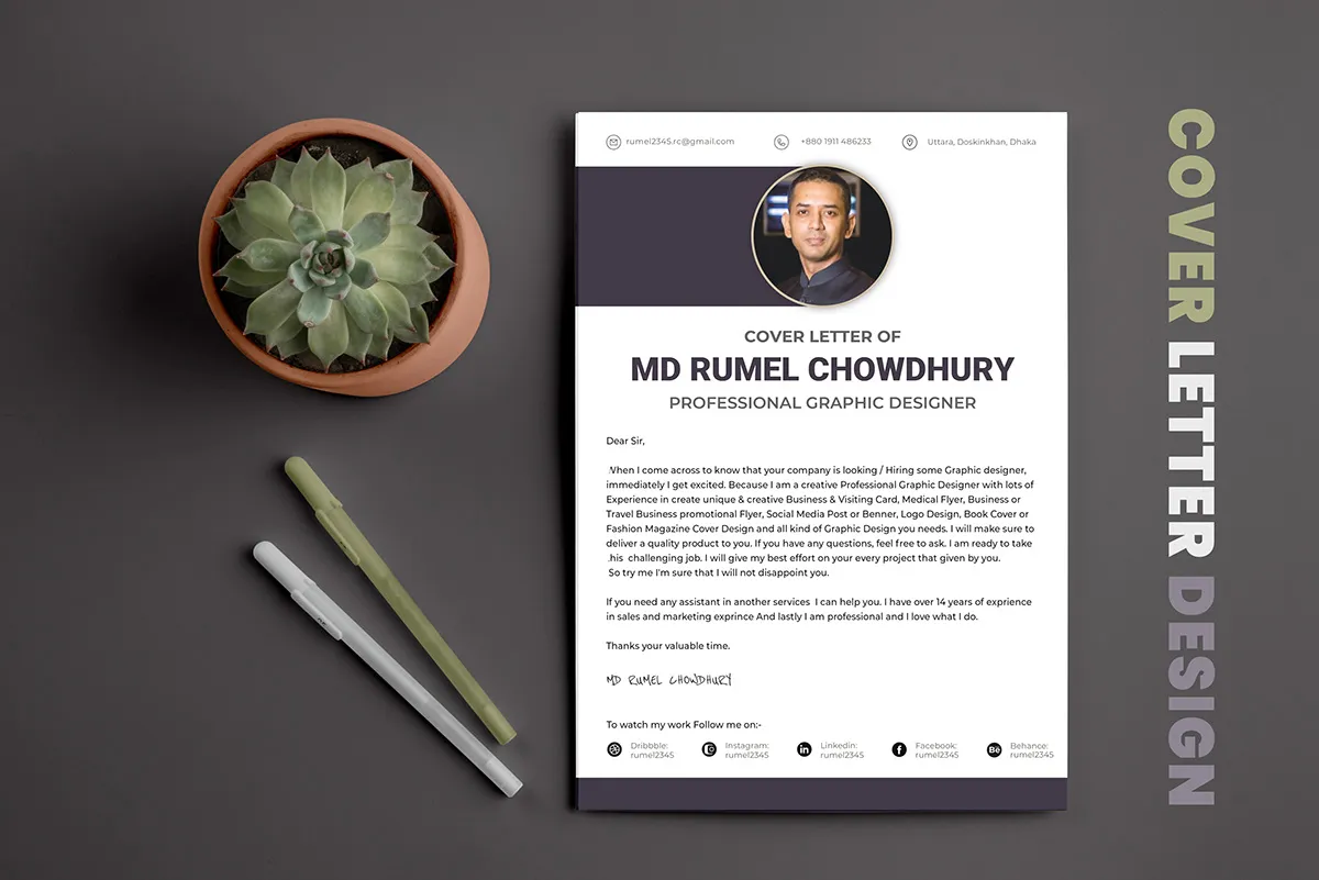
The font you choose can significantly impact the readability and overall look of your cover letter. Select a professional and easy-to-read font, like Arial, Calibri, or Helvetica. Avoid overly stylized fonts that can be difficult to read or project an unprofessional image. Ensure that the font complements your content and conveys the right tone, whether that’s formal, modern, or creative. Consider the company culture; if it’s a tech startup, you might opt for a more contemporary font, while a more traditional company may require a classic serif font. The right font choice reinforces your message and enhances the reader’s experience, making your cover letter more effective.
Font size and readability
Selecting an appropriate font size is crucial for readability. A size between 10 and 12 points is generally recommended for body text, ensuring the content is easy to read without appearing too small or too large. Use a slightly larger font size for headings and your name to create visual hierarchy and guide the reader’s eye. Make sure your font size remains consistent throughout the document; variations can look disorganized. Always preview your cover letter to see how it looks when printed, and ensure that the font size is suitable for both digital and printed versions. Readable fonts and font sizes are very important to create a cover letter.
Effective Use of White Space
White space, or negative space, is an essential design element that significantly improves readability. It refers to the empty areas around text, images, and other design elements. Generous white space prevents the cover letter from appearing cluttered or overwhelming, allowing the reader’s eyes to rest and focus on the content. Use white space around your headings, paragraphs, and between lines to enhance the structure and visual flow. Well-placed white space clarifies the layout, making your letter more organized and easier to scan. Properly utilized white space creates a professional and sophisticated appearance, which enhances the overall impact of your cover letter design.
Margins and spacing
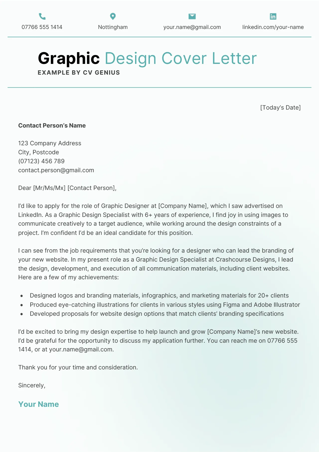
Margins and spacing contribute to a clean and visually appealing design. Set consistent margins (usually 1 inch on all sides) to provide adequate breathing room and prevent text from being too close to the edges of the page. Proper spacing between lines, paragraphs, and sections is also crucial for readability. Use 1.15 or 1.5 line spacing for the body text to enhance the flow. Maintain consistent spacing throughout your cover letter to create a sense of order and professionalism. This attention to detail demonstrates your consideration for presentation, making your cover letter more inviting to read. This is very important to highlight the best cover letter design.
Paragraph Breaks
Strategic paragraph breaks are essential for keeping your cover letter readable and well-organized. Break up long blocks of text into shorter, more manageable paragraphs. This makes the content less daunting and allows the reader to easily scan and digest the information. Each paragraph should focus on a single idea or point, making the overall message clear and concise. Use paragraph breaks to create visual pauses, guiding the reader’s eye through the letter. This enhances the flow and clarity of your writing, helping to communicate your key points effectively. This improves readability and makes your cover letter more engaging and user-friendly.
Color and Design Elements
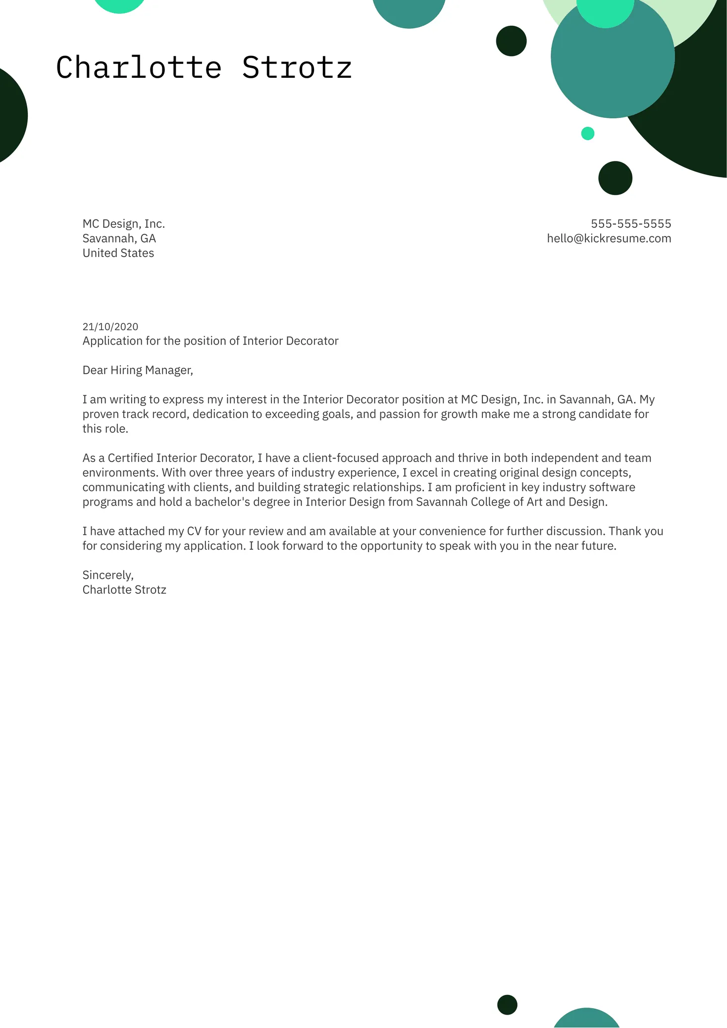
Color and design elements add visual interest to your cover letter, but they should be used judiciously. Choose a color palette that is professional and complements the content, which reflects the company’s brand. Use color sparingly, perhaps for your name, headings, or key details. Overuse can distract from the message. Use design elements like lines, boxes, or subtle backgrounds to create visual separation and highlight important information. Avoid distracting patterns or overly complex designs. The goal is to enhance readability and reinforce your message, not to overwhelm the reader.
Color psychology in cover letters
Understanding color psychology can help you choose the right colors for your cover letter. Colors evoke emotions and can influence how your letter is perceived. Blue often conveys trustworthiness and professionalism, while green suggests growth and stability. Red can convey energy and excitement, but it should be used carefully. Consider the company’s culture and the type of job you’re applying for. Opt for a color scheme that aligns with the company’s brand or industry standards. Your color choices can subconsciously impact the reader’s perception of your personality and qualifications. This is very important to make the best cover letter design.
Use of graphics and icons
Incorporating graphics and icons can make your cover letter more visually appealing and informative. Use icons to represent your contact information (phone, email, LinkedIn profile). Consider adding a subtle graphic element to break up the text or highlight key sections. Make sure any graphics you use are high-quality and relevant to the content. Avoid cluttering your cover letter with too many visuals. The design should complement your content, not distract from it. The graphics should be professional and consistent with the overall tone. Proper use of graphics and icons enhances the readability and visual interest of your cover letter.
Cover Letter Design Layout and Structure
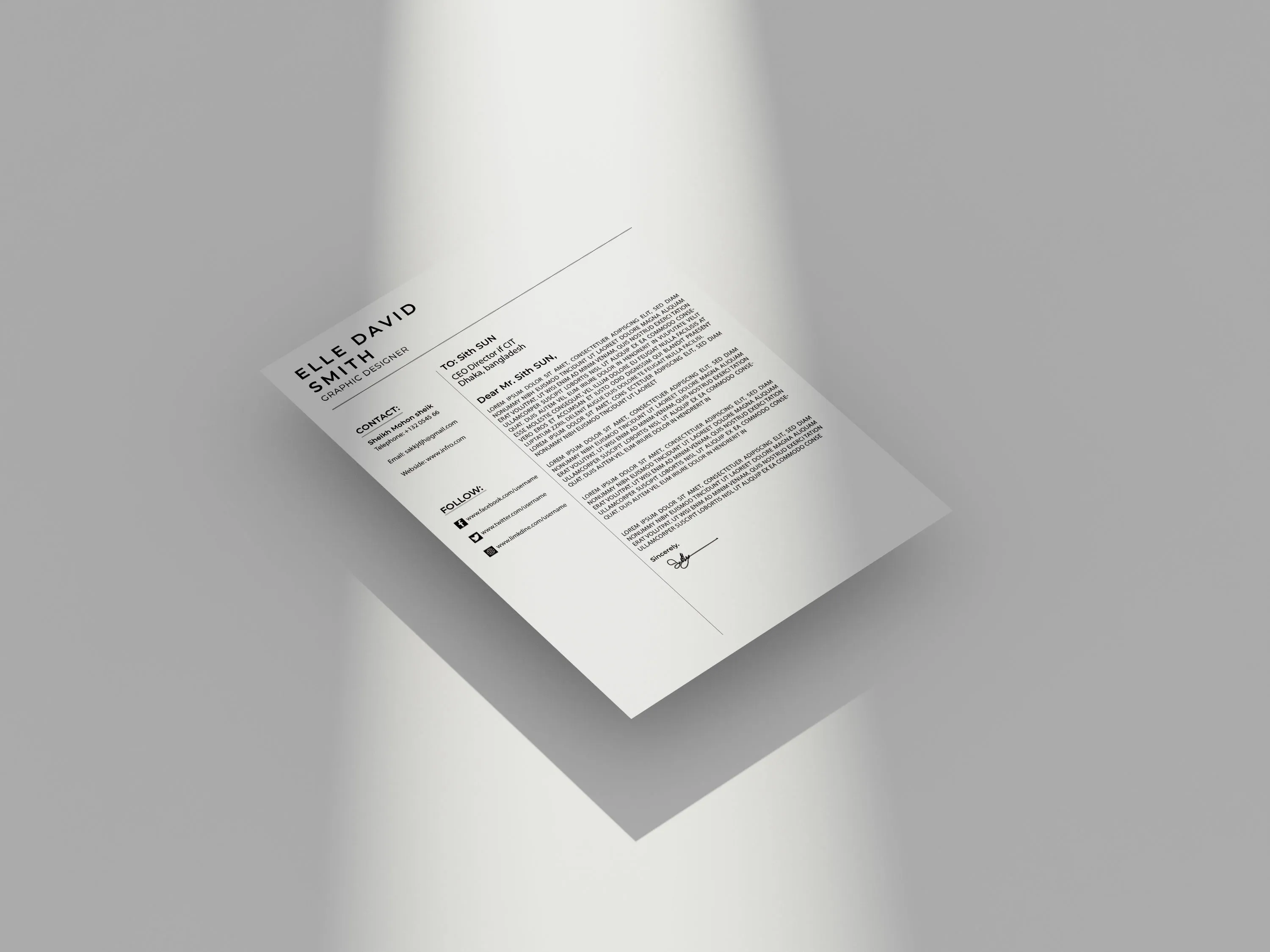
The layout and structure of your cover letter should be clear, concise, and easy to navigate. Follow a standard format, including a header with your contact information, a salutation, an introductory paragraph, body paragraphs, a closing, and a signature. Use headings and subheadings to organize your content and guide the reader through your key points. Ensure the flow is logical and the information is presented in a way that highlights your qualifications and experience. A well-structured cover letter is more likely to capture the reader’s attention and increase your chances of getting an interview. A good layout helps you stand out in the best cover letter design.
Header Design and Contact Information
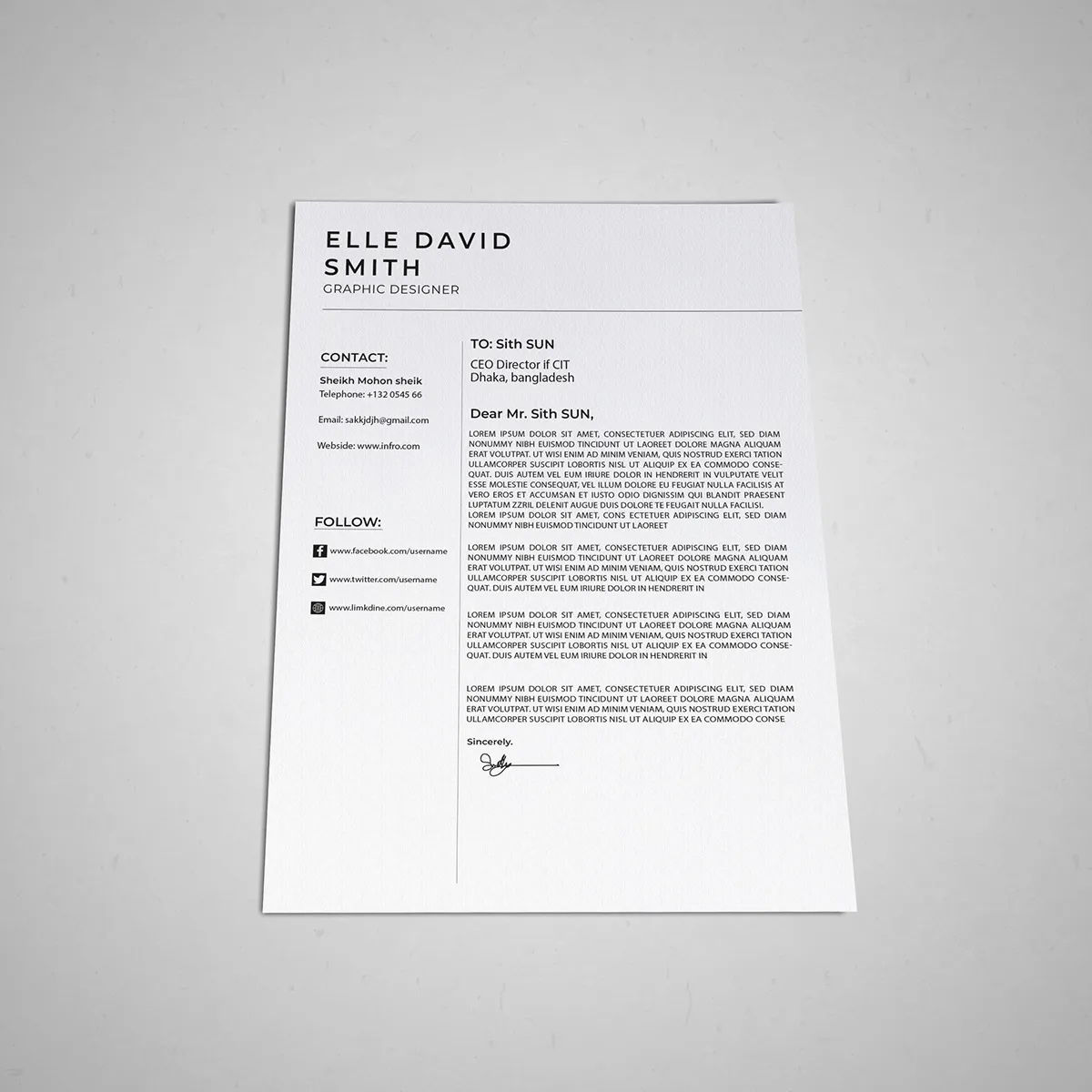
The header is the first element a hiring manager sees, so it should be professional and easy to read. Include your name, address, phone number, email address, and LinkedIn profile URL. The header can be simple and elegant, using a clean font and layout. Make sure the contact information is accurate and up-to-date. Consider using a slightly different font for the header to help it stand out. The design of the header should be consistent with the rest of your cover letter. The header should contain all vital contact information, making it easy for the reader to reach you. This is a crucial step in creating the best cover letter design.
The Body of the Cover Letter
The body of your cover letter is where you highlight your skills and experience and explain why you are a good fit for the role. Use clear, concise language and focus on the value you can bring to the company. Tailor your content to the specific job description, emphasizing the skills and experiences that are most relevant. Use bullet points or numbered lists to present information concisely and make it easy to scan. Demonstrate your personality and enthusiasm for the opportunity. Be sure to proofread your cover letter carefully for any errors. The body of the cover letter should be designed for maximum impact and to convey your message effectively.
Formatting for impact
Use formatting to emphasize key information and make your cover letter more visually appealing. Use bold text to highlight important skills, keywords, and accomplishments. It should be used sparingly. Use italics to emphasize specific points. Underlining can be distracting and is generally not recommended. Use bullet points or numbered lists to present information clearly and concisely. Ensure your formatting is consistent throughout the letter. Avoid using too many formatting styles, as this can make your cover letter look cluttered. Strategic formatting helps guide the reader’s eye and reinforces your key message, creating an impact.
The Closing and Call to Action
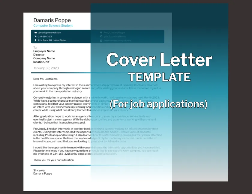
The closing should be professional and include a call to action. Thank the hiring manager for their time and consideration. Reiterate your interest in the role and mention your availability for an interview. Use a strong closing statement that leaves a positive impression. End with a formal closing such as ‘Sincerely’ or ‘Best regards’, followed by your typed name. Proofread the closing carefully to ensure it is error-free. A strong closing reinforces your professionalism and enthusiasm, increasing your chances of a positive response.
Tailoring Your Design for the Job
Customizing your cover letter design to match the job and company is essential. Generic cover letters often fail to make a lasting impression. Research the company’s brand and culture and adapt your design accordingly. Show that you’ve put in the effort to understand their values and needs. Tailor your design to the specific role and industry. If the company has a strong design aesthetic, consider incorporating elements of their branding into your letter. A tailored cover letter demonstrates your attention to detail and shows that you’re genuinely interested in the opportunity.
Researching Company Branding
Before designing your cover letter, research the company’s branding. Explore their website, social media profiles, and any other available materials. Pay attention to their color palette, font choices, and overall design style. This will help you create a cover letter that aligns with their brand identity and demonstrates your understanding of their values. Incorporate elements of their branding into your cover letter design to create a cohesive look. Avoid directly copying their design elements; instead, use their branding as inspiration. Show that you understand their brand and can adapt your style accordingly.
Adapting to Applicant Tracking Systems (ATS)
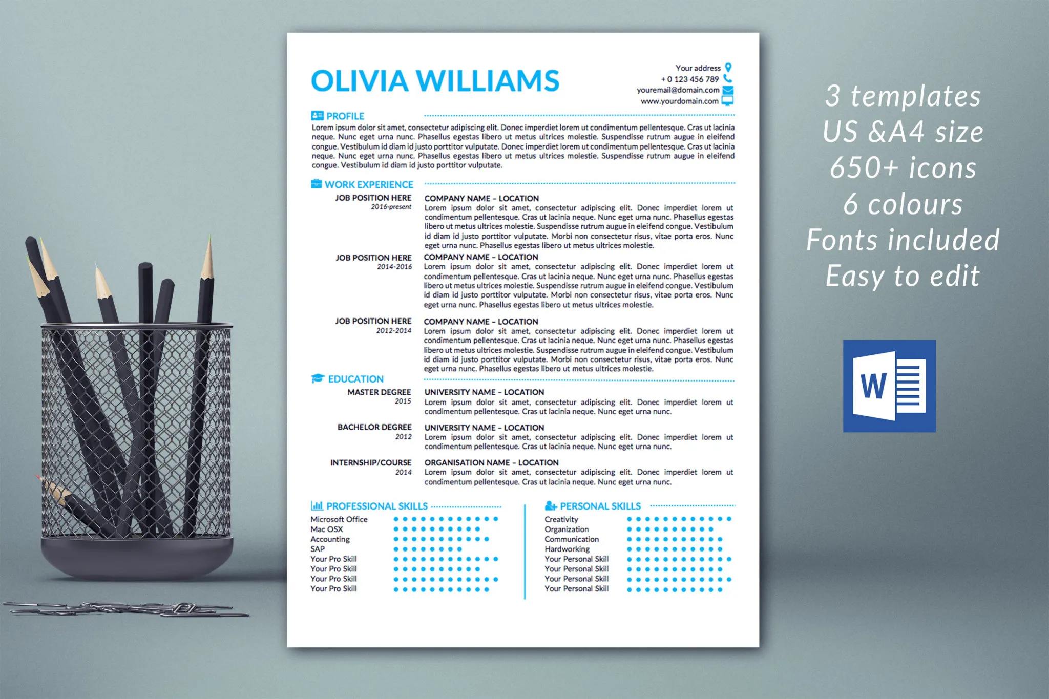
Many companies use Applicant Tracking Systems (ATS) to manage their applications. These systems can sometimes have difficulty parsing complex cover letter designs. To ensure your cover letter is ATS-friendly, keep the design simple. Use a standard font like Arial or Calibri. Avoid using tables, images, or excessive formatting. Ensure your content is formatted in a way that is easy for the ATS to read. Always submit your cover letter in a common format, such as a .docx or .pdf file. Prioritize clear, concise writing, and focus on the keywords related to the job description. This is extremely important to ensure your cover letter reaches the hiring manager. This will make the best cover letter design.
Examples of Great Cover Letter Designs
Reviewing examples of well-designed cover letters is a great way to get inspiration and understand what works. Look for examples that align with the type of job and industry you’re targeting. Pay attention to how different designs use fonts, colors, and layouts to effectively communicate their message. Analyze the structure and flow of the cover letters. Take note of the tone and style of writing. Use these examples as a guide. Remember, it is important to be original and create a design that reflects your personality. The best designs are ones that are tailored to the job. Use these examples as a source of inspiration when creating the best cover letter design.
